
Goals
- Continue working with clustering and classification algorithms
- Work on linear regression models
- Start working on neural network models including single and multilayered perceptrons.
- Continue working on the recommender system
Scoring
Every exercise has an associated difficulty level. Easy and medium-difficult exercises help you understand the fundamentals and give you ideas to work on difficult exercises. It is highly recommended that you finish easy and medium-difficult exercises to have a good score. Given below is the difficulty scale that will be marked for every exercise:
- ★: Easy
- ★★: Medium
- ★★★: Difficult
Guidelines
- To get complete guidance from the mentors, it is highly recommended that you work on today's practical session and not on the preceding ones.
- Make sure that you rename your submission properly and correctly. Double-check your submission.
- Please check the references.
- There are several ways to achieve a task. Hence there are many possible solutions. But try to make maximum use of the libraries that have been suggested to you for your exercises.
Installation
If needed, please refer installation page. For today's exercise, we will continue with the libraries you have already installed.
Exercise 3.1 ★
During practical session 2, we saw a clustering algorithm called KMeans. We will try to get more clusters and also check the time taken by each of these algorithms.
Let's start with some very simple exercises to experiment with the KMeans algorithm. Consider the following data and visualize it on a using a scatter plot.
import numpy as np
import matplotlib.pyplot as plot

numarray = np.array([[1, 1], [1, 2], [1, 3], [1, 4], [1, 5],
              [1, 6], [1, 7], [1, 8],[1, 9], [1, 10],
              [10, 1], [10, 2], [10, 3], [10, 4], [10, 5],
              [10, 6], [10, 7], [10, 8],[10, 9], [10, 10]])
plot.scatter(numarray[:, 0], numarray[:, 1])
plot.show()
Visually, it is quite evident that there are two clusters. But let's use KMeans algorithm to obtain the 2 clusters. We will first see the labels of our clustered data.
import numpy as np
import matplotlib.pyplot as plot
from sklearn.cluster import KMeans

numarray = np.array([[1, 1], [1, 2], [1, 3], [1, 4], [1, 5],
              [1, 6], [1, 7], [1, 8],[1, 9], [1, 10],
              [10, 1], [10, 2], [10, 3], [10, 4], [10, 5],
              [10, 6], [10, 7], [10, 8],[10, 9], [10, 10]])

clusters = KMeans(n_clusters = 2)
clusters.fit(numarray)
print(clusters.labels_)
Now, we will visualize the clusters using a scatter plot. We will use two colors for visually distinguishing them.
import numpy as np
import matplotlib.pyplot as plot
from sklearn.cluster import KMeans

numarray = np.array([[1, 1], [1, 2], [1, 3], [1, 4], [1, 5],
              [1, 6], [1, 7], [1, 8],[1, 9], [1, 10],
              [10, 1], [10, 2], [10, 3], [10, 4], [10, 5],
              [10, 6], [10, 7], [10, 8],[10, 9], [10, 10]])

clusters = KMeans(n_clusters = 2)
clusters.fit(numarray)
colors = np.array(["#ff0000", "#00ff00"])

plot.scatter(numarray[:, 0], numarray[:, 1], c=colors[clusters.labels_])
plot.show()
What if we tried to obtain 4 clusters? Try running the following code, multiple times. Any observation? Try changing the value of n_init with higher values.
import numpy as np
import matplotlib.pyplot as plot
from sklearn.cluster import KMeans

numarray = np.array([[1, 1], [1, 2], [1, 3], [1, 4], [1, 5],
              [1, 6], [1, 7], [1, 8],[1, 9], [1, 10],
              [10, 1], [10, 2], [10, 3], [10, 4], [10, 5],
              [10, 6], [10, 7], [10, 8],[10, 9], [10, 10]])

clusters = KMeans(n_clusters = 4, n_init=2)
clusters.fit(numarray)
colors = np.array(["#ff0000", "#00ff00", "#0000ff", "#ffff00"])

plot.scatter(numarray[:, 0], numarray[:, 1], c=colors[clusters.labels_])
plot.show()
Now we will try obtaining clusters with some real data (reference: citypopulation.json, Source: Wikidata). It contains information concerning different cities of the world: city name, year of its foundation and its population in the year 2010. In the following code, we want to cluster population data and to observe whether there is any correlation between age and recent population (2010) statistics. In the following code, there is a commented line. You can un-comment it to try with different population numbers. Any observation? Why did we use LabelEncoder? What is its purpose?
from pandas.io.json import json_normalize
from sklearn.preprocessing import LabelEncoder
import pandas as pd
import json

data = json.load(open('citypopulation.json'))
dataframe = json_normalize(data)

le = LabelEncoder()
dataframe['cityLabel'] = le.fit_transform(dataframe['cityLabel'])
dataframe = dataframe.astype(dtype= {"year":"<i4", "cityLabel":"<U200", "population":"i"})
dataframe = dataframe.loc[dataframe['year'] > 1500]
#dataframe = dataframe.loc[dataframe['population'] < 700000]
yearPopulation = dataframe[['year', 'population']]


clusters = KMeans(n_clusters = 2, n_init=1000)
clusters.fit(yearPopulation.values)
colors = np.array(["#ff0000", "#00ff00", "#0000ff", "#ffff00"])


plot.rcParams['figure.figsize'] = [10, 10]
plot.scatter(yearPopulation['year'], yearPopulation['population'],
      c=colors[clusters.labels_])
plot.show()
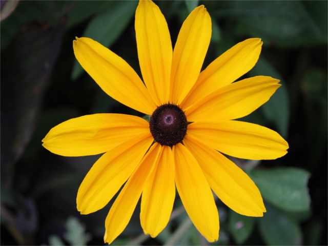
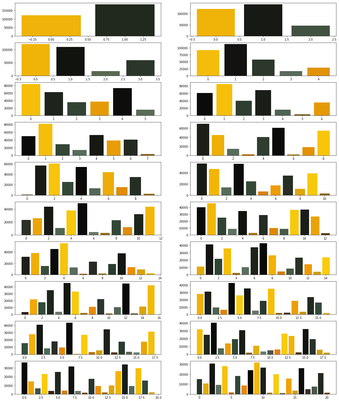
Now let's continue working with flower.jpg. Let's start once again with KMeans and try to get clusters of size between 2 and 11.
             from PIL import Image

             import numpy

             import math

             import matplotlib.pyplot as plot

             from sklearn.cluster import KMeans


             imgfile = Image.open("flower.jpg")

             numarray = numpy.array(imgfile.getdata(), numpy.uint8)


             X = []

             Y = []


             fig, axes = plot.subplots(nrows=5, ncols=2, figsize=(20,25))


             xaxis = 0

             yaxis = 0

             for x in range(2, 12):

                 cluster_count = x


                 clusters = KMeans(n_clusters = cluster_count)

                 clusters.fit(numarray)


                 npbins = numpy.arange(0, cluster_count + 1)

                 histogram = numpy.histogram(clusters.labels_, bins=npbins)

                 labels = numpy.unique(clusters.labels_)


                 barlist = axes[xaxis, yaxis].bar(labels, histogram[0])

                 if(yaxis == 0):

                     yaxis = 1

                 else:

                     xaxis = xaxis + 1

                     yaxis = 0

                 for i in range(cluster_count):

                     barlist[i].set_color('#%02x%02x%02x' % (math.ceil(clusters.cluster_centers_[i][0]),

                         math.ceil(clusters.cluster_centers_[i][1]), math.ceil(clusters.cluster_centers_[i][2])))


             plot.show()
Your next goal is to test the above code for cluster sizes between 2 and 21 which will give you the figure given below.
Note: The following image was generated after 6 minutes. Optionally, you can add print statements to test whether your code is working fine.
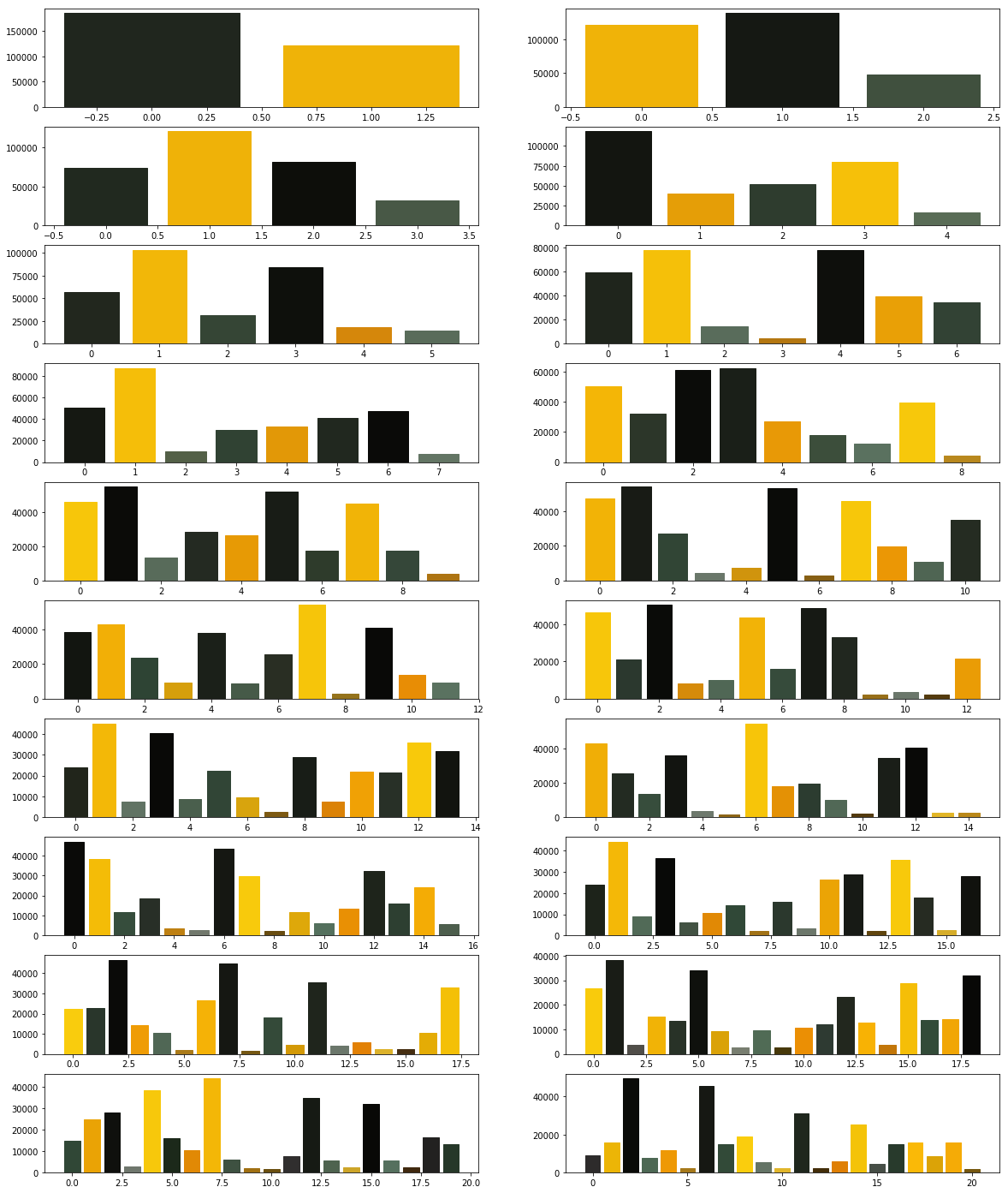
Now we modify the above algorithm to use MiniBatchKMeans clustering algorithm (refer here). Observe the changes.
             from PIL import Image

             import numpy

             import math

             import matplotlib.pyplot as plot

             from sklearn.cluster import MiniBatchKMeans


             imgfile = Image.open("flower.jpg")

             numarray = numpy.array(imgfile.getdata(), numpy.uint8)


             X = []

             Y = []


             fig, axes = plot.subplots(nrows=5, ncols=2, figsize=(20,25))


             xaxis = 0

             yaxis = 0

             for x in range(2, 12):

                 cluster_count = x


                 clusters = MiniBatchKMeans(n_clusters = cluster_count)

                 clusters.fit(numarray)


                 npbins = numpy.arange(0, cluster_count + 1)

                 histogram = numpy.histogram(clusters.labels_, bins=npbins)

                 labels = numpy.unique(clusters.labels_)


                 barlist = axes[xaxis, yaxis].bar(labels, histogram[0])

                 if(yaxis == 0):

                     yaxis = 1

                 else:

                     xaxis = xaxis + 1

                     yaxis = 0

                 for i in range(cluster_count):

                     barlist[i].set_color('#%02x%02x%02x' % (math.ceil(clusters.cluster_centers_[i][0]),

                         math.ceil(clusters.cluster_centers_[i][1]), math.ceil(clusters.cluster_centers_[i][2])))


             plot.show()
What did you observe? Your next goal is to test the above code for cluster sizes between 2 and 21 which will give you the figure given below.
What are your conclusions?
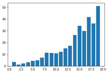
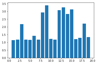
In order to compare the two algorithms, we consider the time taken by each of these algorithms. We will repeat the above experiment, but this time we will plot the time taken to obtain clusters of different sizes.
We start with KMeans.
             from PIL import Image

             import numpy

             import math

             import time

             import matplotlib.pyplot as plot

             from sklearn.cluster import KMeans


             imgfile = Image.open("flower.jpg")

             numarray = numpy.array(imgfile.getdata(), numpy.uint8)


             X = []

             Y = []


             for x in range(1, 20):

                 cluster_count = x


                 start_time = time.time()

                 clusters = KMeans(n_clusters = cluster_count)

                 clusters.fit(numarray)

                 end_time = time.time()

                 total_time = end_time - start_time

                 print("Total time: ", x, ":", total_time)

                 X.append(x)

                 Y.append(total_time)


             plot.bar(X, Y)

             plot.show()
You may get a graph similar to the following.
We now use MiniBatchKMeans.
             from PIL import Image

             import numpy

             import math

             import time

             import matplotlib.pyplot as plot

             from sklearn.cluster import MiniBatchKMeans


             imgfile = Image.open("flower.jpg")

             numarray = numpy.array(imgfile.getdata(), numpy.uint8)


             X = []

             Y = []


             for x in range(1, 20):

                 cluster_count = x


                 start_time = time.time()

                 clusters = MiniBatchKMeans(n_clusters = cluster_count)

                 clusters.fit(numarray)

                 end_time = time.time()

                 total_time = end_time - start_time

                 print("Total time: ", x, ":", total_time)

                 X.append(x)

                 Y.append(total_time)


             plot.bar(X, Y)

             plot.show()
You may get a graph similar to the following.
Now test the above code using MiniBatchKMeans algorithm with cluster sizes between 2 and 50. What are your observations?
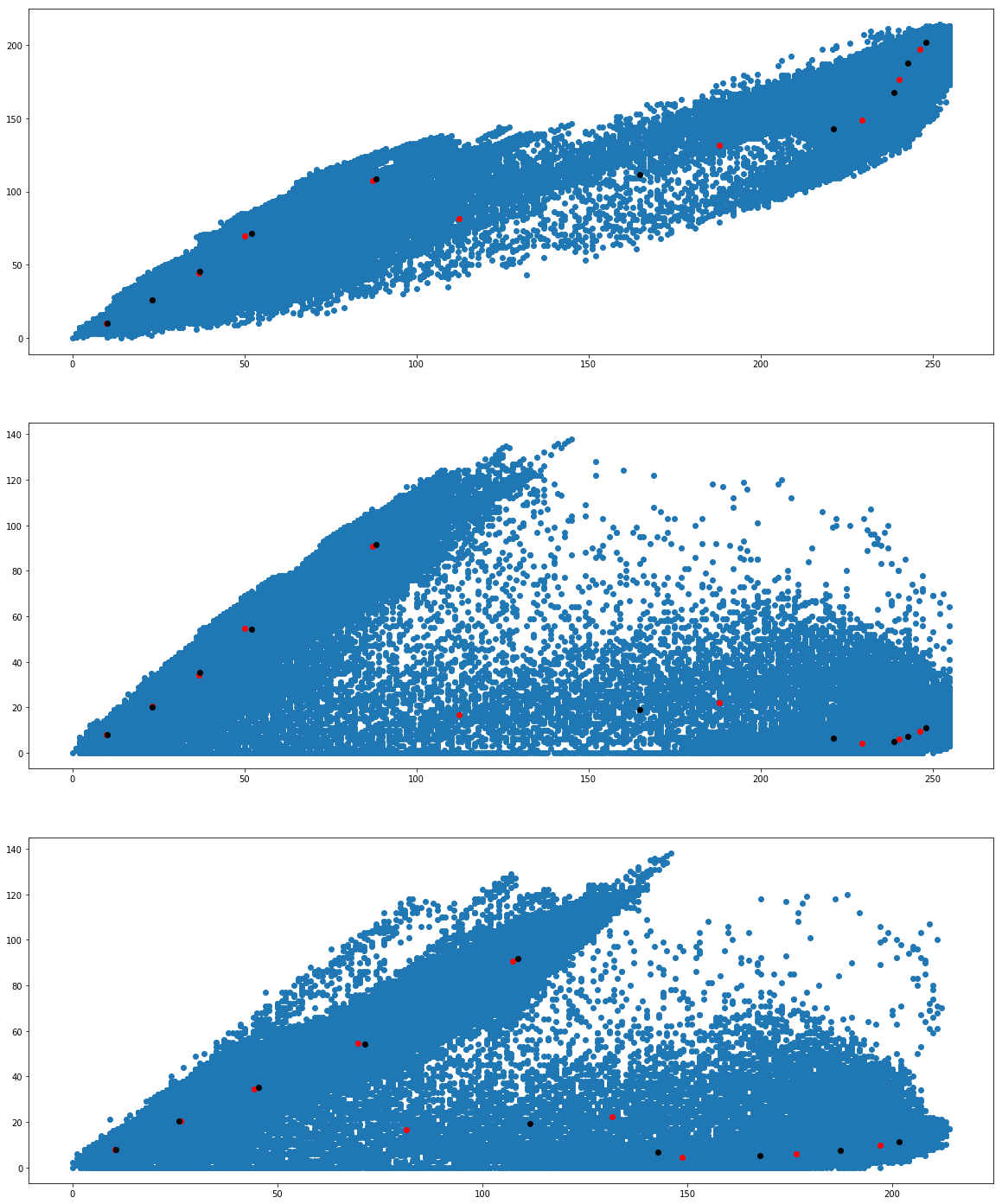
Finally we want to see whether we get the same cluster centers from both the algorithms. Run the following program to see the cluster centers produced by the two algorithms. We use two different colors (red and black) to distinguish the cluster centers from the two algorithms.
              from PIL import Image

              import numpy

              import math

              import matplotlib.pyplot as plot

              from sklearn.cluster import KMeans

              from sklearn.cluster import MiniBatchKMeans


              imgfile = Image.open("flower.jpg")

              numarray = numpy.array(imgfile.getdata(), numpy.uint8)


              cluster_count = 10


              clusters = KMeans(n_clusters = cluster_count)

              clusters.fit(numarray)


              mclusters = MiniBatchKMeans(n_clusters = cluster_count)

              mclusters.fit(numarray)


              fig, axes = plot.subplots(nrows=3, ncols=1, figsize=(20,25))

              #Scatter plot for RG (RGB)

              axes[0].scatter(numarray[:,0],numarray[:,1])

              axes[0].scatter(clusters.cluster_centers_[:,0], clusters.cluster_centers_[:,1], c='red')

              axes[0].scatter(mclusters.cluster_centers_[:,0], mclusters.cluster_centers_[:,1], c='black')


              #Scatter plot of RB (RGB)

              axes[1].scatter(numarray[:,0],numarray[:,2])

              axes[1].scatter(clusters.cluster_centers_[:,0], clusters.cluster_centers_[:,2], c='red')

              axes[1].scatter(mclusters.cluster_centers_[:,0], mclusters.cluster_centers_[:,2], c='black')


              #Scatter plot of GB (RGB)

              axes[2].scatter(numarray[:,1],numarray[:,2])

              axes[2].scatter(clusters.cluster_centers_[:,1], clusters.cluster_centers_[:,2], c='red')

              axes[2].scatter(mclusters.cluster_centers_[:,1], mclusters.cluster_centers_[:,2], c='black')
We would like to see how the individual pixel values have been clustered. Run the following program a couple of times.
              from PIL import Image

              import numpy

              import math

              import time

              import matplotlib.pyplot as plot

              from sklearn.cluster import KMeans

              from sklearn.cluster import MiniBatchKMeans


              imgfile = Image.open("flower.jpg")

              numarray = numpy.array(imgfile.getdata(), numpy.uint8)


              cluster_count = 10


              mclusters = MiniBatchKMeans(n_clusters = cluster_count)

              mclusters.fit(numarray)


              npbins = numpy.arange(0, cluster_count + 1)

              histogram = numpy.histogram(mclusters.labels_, bins=npbins)

              labels = numpy.unique(mclusters.labels_)


              fig, axes = plot.subplots(nrows=3, ncols=2, figsize=(20,25))


              #Scatter plot for RG (RGB)

              colors = []

              for i in range(len(numarray)):

                  j = mclusters.labels_[i]

                  colors.append('#%02x%02x%02x' % (math.ceil(mclusters.cluster_centers_[j][0]),

                         math.ceil(mclusters.cluster_centers_[j][1]), 0))


              axes[0,0].scatter(numarray[:,0],numarray[:,1], c=colors)

              axes[0,0].scatter(mclusters.cluster_centers_[:,0], mclusters.cluster_centers_[:,1], marker="+", c='red')


              #Scatter plot for RB (RGB)

              colors = []

              for i in range(len(numarray)):

                  j = mclusters.labels_[i]

                  colors.append('#%02x%02x%02x' % (math.ceil(mclusters.cluster_centers_[j][0]),

                         0, math.ceil(mclusters.cluster_centers_[j][2])))


              axes[1,0].scatter(numarray[:,0],numarray[:,2], c=colors)

              axes[1,0].scatter(mclusters.cluster_centers_[:,0], mclusters.cluster_centers_[:,2], marker="+", c='white')


              #Scatter plot for GB (RGB)

              colors = []

              for i in range(len(numarray)):

                  j = mclusters.labels_[i]

                  colors.append('#%02x%02x%02x' % (0, math.ceil(mclusters.cluster_centers_[j][1]),

                          math.ceil(mclusters.cluster_centers_[j][2])))


              axes[2,0].scatter(numarray[:,1],numarray[:,2], c=colors)

              axes[2,0].scatter(mclusters.cluster_centers_[:,1], mclusters.cluster_centers_[:,2], marker="+", c='yellow')


              clusters = KMeans(n_clusters = cluster_count)

              clusters.fit(numarray)


              npbins = numpy.arange(0, cluster_count + 1)

              histogram = numpy.histogram(clusters.labels_, bins=npbins)

              labels = numpy.unique(clusters.labels_)


              #Scatter plot for RG (RGB)

              colors = []

              for i in range(len(numarray)):

                  j = clusters.labels_[i]

                  colors.append('#%02x%02x%02x' % (math.ceil(clusters.cluster_centers_[j][0]),

                         math.ceil(clusters.cluster_centers_[j][1]), 0))


              axes[0,1].scatter(numarray[:,0],numarray[:,1], c=colors)

              axes[0,1].scatter(clusters.cluster_centers_[:,0], clusters.cluster_centers_[:,1], marker="+", c='red')


              #Scatter plot for RB (RGB)

              colors = []

              for i in range(len(numarray)):

                  j = clusters.labels_[i]

                  colors.append('#%02x%02x%02x' % (math.ceil(clusters.cluster_centers_[j][0]),

                         0, math.ceil(clusters.cluster_centers_[j][2])))


              axes[1,1].scatter(numarray[:,0],numarray[:,2], c=colors)

              axes[1,1].scatter(clusters.cluster_centers_[:,0], clusters.cluster_centers_[:,2], marker="+", c='white')


              #Scatter plot for GB (RGB)

              colors = []

              for i in range(len(numarray)):

                  j = clusters.labels_[i]

                  colors.append('#%02x%02x%02x' % (0, math.ceil(clusters.cluster_centers_[j][1]),

                          math.ceil(clusters.cluster_centers_[j][2])))


              axes[2,1].scatter(numarray[:,1],numarray[:,2], c=colors)

              axes[2,1].scatter(clusters.cluster_centers_[:,1], clusters.cluster_centers_[:,2], marker="+", c='yellow')

              plot.show()
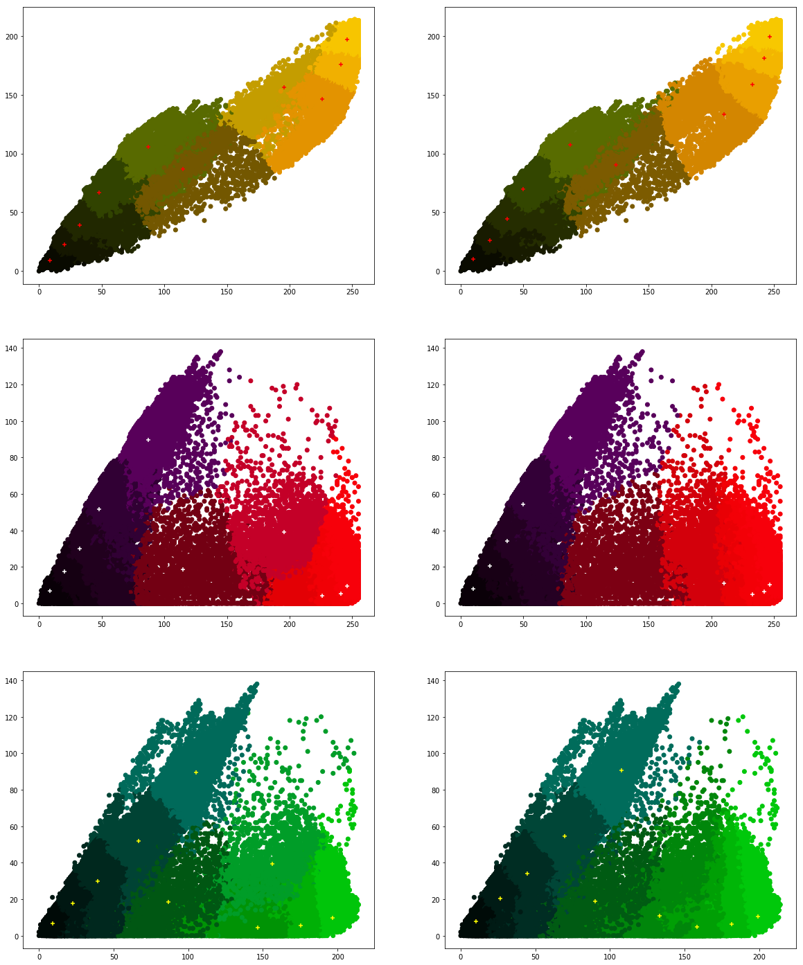
What are your conclusions?
Exercise 3.2 ★
We will now work with linear regression (refer here).
Let's see some simple programs. In the following data, where we have some sample data for the equation: y = x. We will first train our Linear Regression model with a very small subset and test whether it is able to predict y-values for new x-values.
import numpy as np
import matplotlib.pyplot as plot
from sklearn.linear_model import LinearRegression
numarray = np.array([[0,0], [1,1], [2,2], [3,3], [4,4], [5,5]])

lr = LinearRegression()
lr.fit(numarray[:, 0].reshape(-1, 1), numarray[:, 1].reshape(-1, 1))

#printing coefficients
print(lr.intercept_, lr.coef_)

x_predict = np.array([6, 7, 8, 9, 10])

y_predict = lr.predict(x_predict.reshape(-1, 1))
print(y_predict)
Next, we have some sample data for the equation: y = x + 1. We will train our Linear Regression model test whether it is able to predict y-values for new x-values.
import numpy as np
import matplotlib.pyplot as plot
from sklearn.linear_model import LinearRegression

numarray = np.array([[0,1], [1,2], [2,3], [3,4], [4,5], [5,6]])

lr = LinearRegression()
lr.fit(numarray[:, 0].reshape(-1, 1), numarray[:, 1].reshape(-1, 1))

#printing coefficients
print(lr.intercept_, lr.coef_)

x_predict = np.array([6, 7, 8, 9, 10])

y_predict = lr.predict(x_predict.reshape(-1, 1))
print(y_predict)
But, what if we tried the Linear Regression model for the equation: y = x2. What did you observe with the following code? Did it predict the y-values correctly?
import numpy as np
import matplotlib.pyplot as plot
from sklearn.linear_model import LinearRegression

numarray = np.array([[0,0], [1,1], [2,4], [3,9], [4,16], [5,25]])

lr = LinearRegression()
lr.fit(numarray[:, 0].reshape(-1, 1), numarray[:, 1].reshape(-1, 1))

#printing coefficients
print(lr.intercept_, lr.coef_)

x_predict = np.array([6, 7, 8, 9, 10])

y_predict = lr.predict(x_predict.reshape(-1, 1))
print(y_predict)
Now, Let's repeat the above experiment by making use of Polynomial features. Try changing the value of degree in the code given below.
import numpy as np
import matplotlib.pyplot as plot
from sklearn.linear_model import LinearRegression
from sklearn.preprocessing import PolynomialFeatures

numarray = np.array([[0,0], [1,1], [2,4], [3,9], [4,16], [5,25]])

#using polynomial features
pf = PolynomialFeatures(degree=2)
x_poly = pf.fit_transform(numarray[:, 0].reshape(-1, 1))
lr = LinearRegression()
lr.fit(x_poly, numarray[:, 1].reshape(-1, 1))

#printing coefficients
print(lr.intercept_, lr.coef_)

x_predict = np.array([6, 7, 8, 9, 10])

y_predict = lr.predict(pf.fit_transform(x_predict.reshape(-1, 1)))
print(y_predict)
Now let's try with third order polynomial equation (cubic equation).
import numpy as np
import matplotlib.pyplot as plot
from sklearn.linear_model import LinearRegression
from sklearn.preprocessing import PolynomialFeatures

numarray = np.array([[0,0], [1,1], [2,8], [3,27], [4,64], [5,125]])

#using polynomial features
pf = PolynomialFeatures(degree=3)
x_poly = pf.fit_transform(numarray[:, 0].reshape(-1, 1))
lr = LinearRegression()
lr.fit(x_poly, numarray[:, 1].reshape(-1, 1))

#printing coefficients
print(lr.intercept_, lr.coef_)

x_predict = np.array([6, 7, 8, 9, 10])

y_predict = lr.predict(pf.fit_transform(x_predict.reshape(-1, 1)))
print(y_predict)
Download the file population.csv (source: query given in references). We will first plot this multi-annual population.
           import numpy as np

           import matplotlib.pyplot as plot

           import pandas as pd

           dataset = np.loadtxt("population.csv", dtype={'names': ('year', 'population'), 'formats': ('i4', 'i')},

               skiprows=1, delimiter=",", encoding="UTF-8")


           df = pd.DataFrame(dataset)

           df.plot(x='year', y='population', kind='scatter')
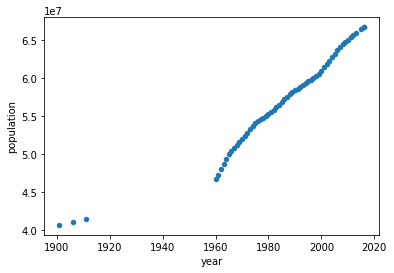
We will focus on data starting from 1960 (why?). Our goal is to use regression techniques to predict population. But we don't know how to verify. So with the available data, we create two categories: training data and test data.
Now continuing with the population data (from TP1 and TP2), we split it into two: training data and test data. We will plot the actual population values and the predicted values.
           import numpy as np

           import matplotlib.pyplot as plot

           import pandas as pd

           from sklearn.linear_model import LinearRegression

           dataset = np.loadtxt("population.csv", dtype={'names': ('year', 'population'), 'formats': ('i4', 'i')},

               skiprows=1, delimiter=",", encoding="UTF-8")


           df = pd.DataFrame(dataset[4:])


           #training data

           x_train = df['year'][:40].values.reshape(-1, 1)

           y_train = df['population'][:40].values.reshape(-1, 1)


           #training

           lr = LinearRegression()

           lr.fit(x_train, y_train)


           #printing coefficients

           print(lr.intercept_, lr.coef_)


           #prediction

           x_predict = x_train = df['year'][41:].values.reshape(-1, 1)

           y_actual = df['population'][41:].values.reshape(-1, 1)

           y_predict = lr.predict(x_predict)


           plot.scatter(x_predict, y_actual)

           plot.plot(x_predict, y_predict, color='red', linewidth=2)

           plot.show()
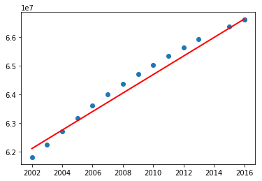
Now test the above program including the data before 1960. What did you notice? You may have got the following graph.
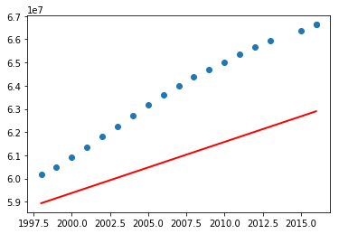
What are your observations? So the above program using linear regression perfectly fit for a subset of data. Let's now try with polynomial features with degree 2 (refer Polynomial Regression: Extending linear models).
           import numpy as np

           import matplotlib.pyplot as plot

           import pandas as pd

           from sklearn.linear_model import LinearRegression

           from sklearn.preprocessing import PolynomialFeatures

           dataset = np.loadtxt("population.csv", dtype={'names': ('year', 'population'), 'formats': ('i4', 'i')},

               skiprows=1, delimiter=",", encoding="UTF-8")


           df = pd.DataFrame(dataset[4:])


           #training data


           x_train = df['year'][:50].values.reshape(-1, 1)

           y_train = df['population'][:50].values.reshape(-1, 1)


           pf = PolynomialFeatures(degree=2)

           x_poly = pf.fit_transform(x_train)


           #training

           lr = LinearRegression()

           lr.fit(x_poly, y_train)


           #printing coefficients

           print(lr.intercept_, lr.coef_)


           #prediction

           x_predict = x_train = df['year'][41:].values.reshape(-1, 1)

           y_actual = df['population'][41:].values.reshape(-1, 1)

           y_predict = lr.predict(pf.fit_transform(x_predict))


           plot.scatter(x_predict, y_actual)

           plot.plot(x_predict, y_predict, color='red', linewidth=2)

           plot.show()
Before jumping into a conclusion, let's consider the entire data and see.
           import numpy as np

           import matplotlib.pyplot as plot

           import pandas as pd

           from sklearn.linear_model import LinearRegression

           from sklearn.preprocessing import PolynomialFeatures

           dataset = np.loadtxt("population.csv", dtype={'names': ('year', 'population'), 'formats': ('i4', 'i')},

               skiprows=1, delimiter=",", encoding="UTF-8")


           df = pd.DataFrame(dataset)


           #training data


           x_train = df['year'][:40].values.reshape(-1, 1)

           y_train = df['population'][:40].values.reshape(-1, 1)


           pf = PolynomialFeatures(degree=2)

           x_poly = pf.fit_transform(x_train)


           #training

           lr = LinearRegression()

           lr.fit(x_poly, y_train)


           #printing coefficients

           print(lr.intercept_, lr.coef_)


           #prediction

           x_predict = x_train = df['year'][41:].values.reshape(-1, 1)


           # Let's add some more years

           x_predict = np.append(range(1900, 1959), x_predict)

           x_predict = x_predict.reshape(-1, 1)


           y_actual = df['population'][41:].values.reshape(-1, 1)

           y_predict = lr.predict(pf.fit_transform(x_predict))


           plot.scatter(df['year'], df['population'])

           plot.plot(x_predict, y_predict, color='red', linewidth=2)

           plot.show()
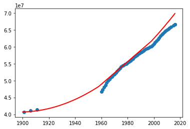
What do you think? Can we use this program to predict the missing data (especially in the absence of other external source of information)? Try the above program with different degrees.
Exercise 3.3 ★★
Classifiers are helpful to classify our dataset into one or more classes. But unlike clustering algorithms, it's the user who has to classify the data in a classification algorithm. In the following exercises, we see different classifiers, starting with perceptron. Look at the input data (numarray) and the associated labels (result). Here, we will label the complete dataset and see whether our model (Perceptron) did work well.
import numpy as np
import matplotlib.pyplot as plot
from sklearn.linear_model import Perceptron

numarray = np.array([[0,0,0,0], [0,0,0,1], [0,0,1,0], [0,0,1,1],
                     [0,1,0,0], [0,1,0,1], [0,1,1,0], [0,1,1,1],
                     [1,0,0,0], [1,0,0,1], [1,0,1,0], [1,0,1,1],
                     [1,1,0,0], [1,1,0,1], [1,1,1,0], [1,1,1,1]])
result = np.array([0, 0, 0, 0,
                     0, 0, 0, 0,
                     1, 1, 1, 1,
                     1, 1, 1, 1])

perceptron = Perceptron(max_iter=1000)
perceptron.fit(numarray, result)

x_predict = np.array([[0,1,0,1], [1,0,1,1] ])

y_predict = perceptron.predict(x_predict)
print(y_predict)
Now we will remove some labeled/classified data and see the predicted results.
import numpy as np
import matplotlib.pyplot as plot
from sklearn.linear_model import Perceptron

numarray = np.array([[0,0,0,0], [0,0,0,1],
                     [0,1,0,0], [0,1,1,1],
                     [1,0,0,1], [1,0,1,0],
                     [1,1,1,0], [1,1,1,1]])
result = np.array([0, 0,
                     0, 0,
                     1, 1,
                     1, 1])

perceptron = Perceptron(max_iter=1000)
perceptron.fit(numarray, result)

x_predict = np.array([[0,1,0,1], [1,0,1,1], [1,1,0,0], [0,1,0,1]])

y_predict = perceptron.predict(x_predict)
print(y_predict)
Now, we will try another classifer: MLPClassifier
import numpy as np
import matplotlib.pyplot as plot
from sklearn.neural_network import MLPClassifier

numarray = np.array([[0,0,0,0], [0,0,0,1],
                     [0,1,0,0], [0,1,1,1],
                     [1,0,0,1], [1,0,1,0],
                     [1,1,1,0], [1,1,1,1]])

result = np.array([0, 0,
                   0, 0,
                   1, 1,
                   1, 1])

mlpclassifier = MLPClassifier(alpha=2, max_iter=1000)
mlpclassifier.fit(numarray, result)

x_predict = np.array([[0,1,0,1], [1,0,1,1], [1,1,0,0], [0,1,0,1]])

y_predict = mlpclassifier.predict(x_predict)
print(y_predict)
Now, we will try another classifer using support vector machines.
import numpy as np
import matplotlib.pyplot as plot
from sklearn import datasets, svm, metrics

numarray = numarray = np.array([[0,0,0,0], [0,0,0,1],
                     [0,1,0,0], [0,1,1,1],
                     [1,0,0,1], [1,0,1,0],
                     [1,1,1,0], [1,1,1,1]])

result = np.array([0, 0,
                   0, 0,
                   1, 1,
                   1, 1])

svcclassifier = svm.SVC(gamma=0.001, C=100.)
svcclassifier.fit(numarray, result)

x_predict = np.array([[0,1,0,1], [1,0,1,1], [1,1,0,0], [0,1,0,1]])

y_predict = svcclassifier.predict(x_predict)
print(y_predict)
We will now use scikit-learn and the classifiers seen above to recognize handwriting. Scikit-learn has a lot of datasets. We will use one such dataset called digits dataset, which consists of labeled handwriting images of digits. The following program will show the labels.
             from sklearn import datasets

             import numpy as np


             digits = datasets.load_digits()


             print(np.unique(digits.target))
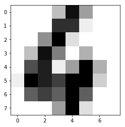
We will now see the total number of images and the contents of one test image.
             from sklearn import datasets

             import numpy as np

             import matplotlib.pyplot as plot


             digits = datasets.load_digits()


             print("Number of images: ", digits.images.size)

             print("Input data: ", digits.images[0])

             print("Label:", digits.target[0])


             plot.imshow(digits.images[0], cmap=plot.cm.gray_r)

             plot.show()
We will now use a support vector classifier to train the data. We will split our data into two: training data and test data. Remember that we already have labels for the entire dataset.
             from sklearn import datasets, svm

             import numpy as np

             import matplotlib.pyplot as plot


             digits = datasets.load_digits()


             training_images = digits.images[:int(digits.images.shape[0]/2)]

             training_images = training_images.reshape((training_images.shape[0], -1))


             training_target = digits.target[0:int(digits.target.shape[0]/2)]


             classifier = svm.SVC(gamma=0.001, C=100.)

             #training

             classifier.fit(training_images, training_target)


             #prediction

             predict_image = digits.images[int(digits.images.shape[0]/2)+2]

             print("Predicted value: ", classifier.predict(predict_image.reshape(1,-1)))


             plot.imshow(predict_image, cmap=plot.cm.gray_r)

             plot.show()
Now let's try predicting the remaining labels and use the classifcation report to get the precision of prediction.
             from sklearn import datasets, svm, metrics

             import numpy as np

             import matplotlib.pyplot as plot


             digits = datasets.load_digits()


             training_images = digits.images[:int(digits.images.shape[0]/2)]

             training_images = training_images.reshape((training_images.shape[0], -1))


             training_target = digits.target[0:int(digits.target.shape[0]/2)]


             classifier = svm.SVC(gamma=0.001, C=100.)

             #training

             classifier.fit(training_images, training_target)


             #prediction

             predict_images = digits.images[int(digits.images.shape[0]/2)+1:]

             actual_labels = digits.target[int(digits.target.shape[0]/2)+1:]

             predicted_labels = classifier.predict(predict_images.reshape((predict_images.shape[0], -1)))


             #classification report

             print(metrics.classification_report(actual_labels,predicted_labels))
There are other classifiers available. We will now work with Perceptron (refer here) and see its performance.
             from sklearn import datasets, metrics

             from sklearn.linear_model import Perceptron

             import numpy as np

             import matplotlib.pyplot as plot


             digits = datasets.load_digits()


             training_images = digits.images[:int(digits.images.shape[0]/2)]

             training_images = training_images.reshape((training_images.shape[0], -1))


             training_target = digits.target[0:int(digits.target.shape[0]/2)]


             classifier = Perceptron(max_iter=1000)

             #training

             classifier.fit(training_images, training_target)


             #prediction

             predict_images = digits.images[int(digits.images.shape[0]/2)+1:]

             actual_labels = digits.target[int(digits.target.shape[0]/2)+1:]

             predicted_labels = classifier.predict(predict_images.reshape((predict_images.shape[0], -1)))


             #classification report

             print(metrics.classification_report(actual_labels,predicted_labels))
Finally, we will finish the test with Multilayer Perceptron (refer here).
             from sklearn import datasets, metrics

             from sklearn.neural_network import MLPClassifier

             import numpy as np

             import matplotlib.pyplot as plot


             digits = datasets.load_digits()


             training_images = digits.images[:int(digits.images.shape[0]/2)]

             training_images = training_images.reshape((training_images.shape[0], -1))


             training_target = digits.target[0:int(digits.target.shape[0]/2)]


             classifier = MLPClassifier(alpha=2, max_iter=1000)

             #training

             classifier.fit(training_images, training_target)


             #prediction

             predict_images = digits.images[int(digits.images.shape[0]/2)+1:]

             actual_labels = digits.target[int(digits.target.shape[0]/2)+1:]

             predicted_labels = classifier.predict(predict_images.reshape((predict_images.shape[0], -1)))


             #classification report

             print(metrics.classification_report(actual_labels,predicted_labels))
Did you try changing the number of hidden layers?
What are your observations after trying the different classifiers?
Exercise 3.4 ★★
In this exercise, we will label different parts of images and train a classifier. Then we will predict the labels. Let's start by splitting an image into sub-images in the following manner.
             import os,sys

             from PIL import Image

             import matplotlib.pyplot as plot

             import numpy


             imgfile = Image.open("flower.jpg")

             print(imgfile.size)


             figure, axes = plot.subplots(nrows=5, ncols=5, figsize=(20,25))


             xaxis = 0

             for i in range(0, 640, 128):

                 yaxis=0

                 for j in range(0,480, 96):

                     #print(i, j)

                     bbox = (i, j, i+128, j+96)

                     axes[xaxis, yaxis].imshow(imgfile.crop(bbox))

                     yaxis = yaxis + 1

                 xaxis = xaxis + 1


             plot.show()
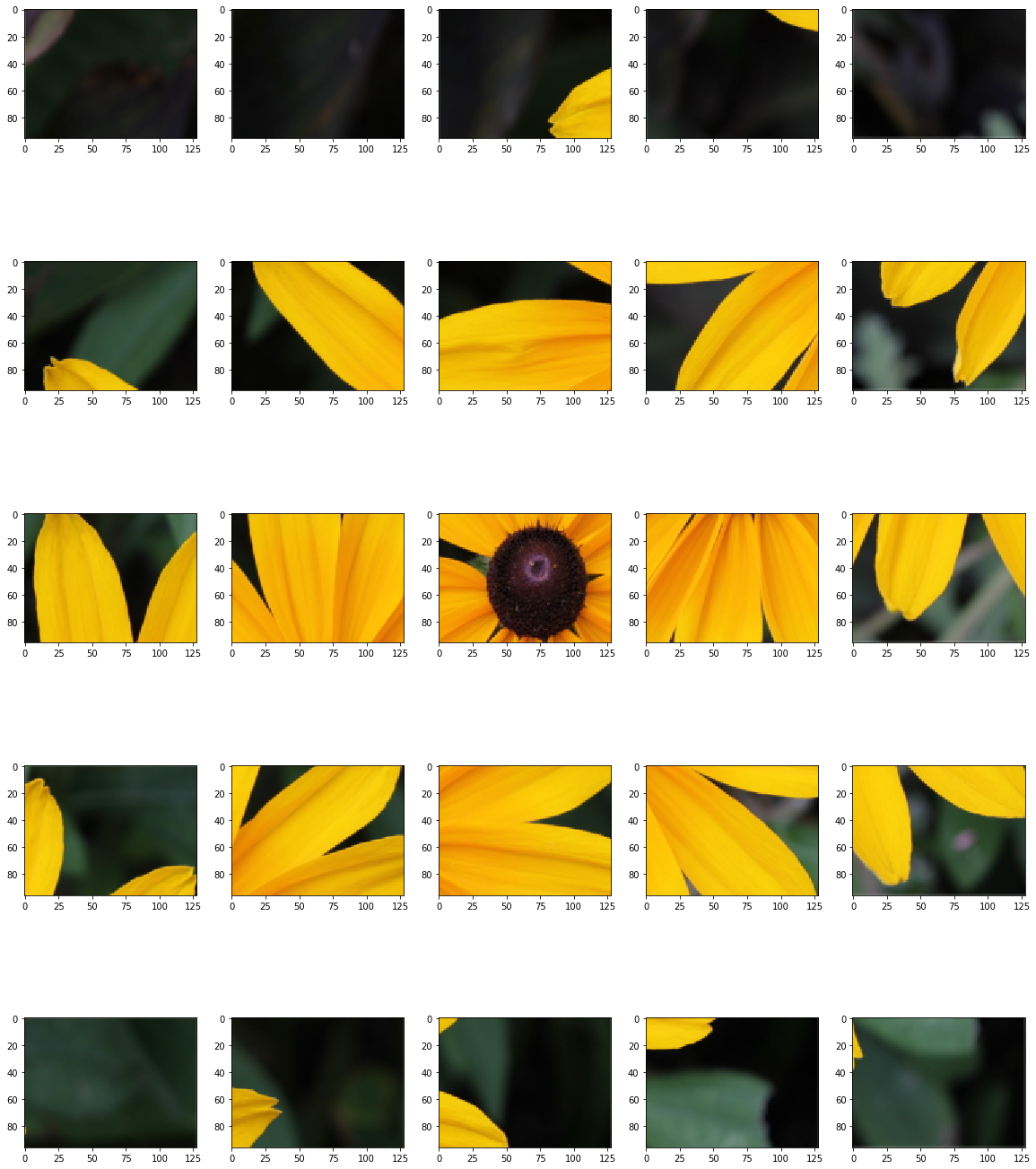
Your next goal is to first reorder the above sub-images so that it looks similar to the original image (like a jig-saw puzzle). For this purpose, you have to modify the above code. Then you label these subimages based on the predominant colors. You can ask the user to label the subimages into colors, like green, yellow, etc. For every subimage, we will have only one color. Then train and test your classifiers using the following methods.
- Support vector classifier (SVC)
- Perceptron
- Multilayer Perceptron
Do not forget to print the classification report for every classifier. How was the precision of every classifier that you considered? Can you increase the number of subimages and test again?
Exercise 3.5 ★★★
Project: Image recommender system: 3 practical sessions
Recall that the goal of this project is to recommend images based on the color preferences of the user. We will build this system in three practical sessions.
During your last practical session, you collected images and obtained the predominant colors in each image. Now with your knowledge in different types of classifiers and clustering algorithms, what more information will you add for every image?
For every image, you already have the following information
- Predominant colors in an image
- Image size
- How about asking users to tag the images? E.g., colors, cat, flower, sunflower, rose etc.
- How about asking users to tag subimages in a similar fashion?
- ...
Ask the user to select some images. We may assume that those images contain the favorite colors of the user, or other favorite characteristics. For every user, you are now in a position to build user-preference profile
- Favorite colors
- Favorite image sizes (thumbnail images, large images, medium-size images etc.)
- Tags
- ...
Are you now in a position to recommend images to a user? What's missing?
Submission
- Rename your notebook as Name1_Name2_[Name3].ipynb, where Name1, Name2 are your names.
- Submit your notebook online.
- Please don't submit your JSON, TSV and CSV files.